Field marketing tool
Overview
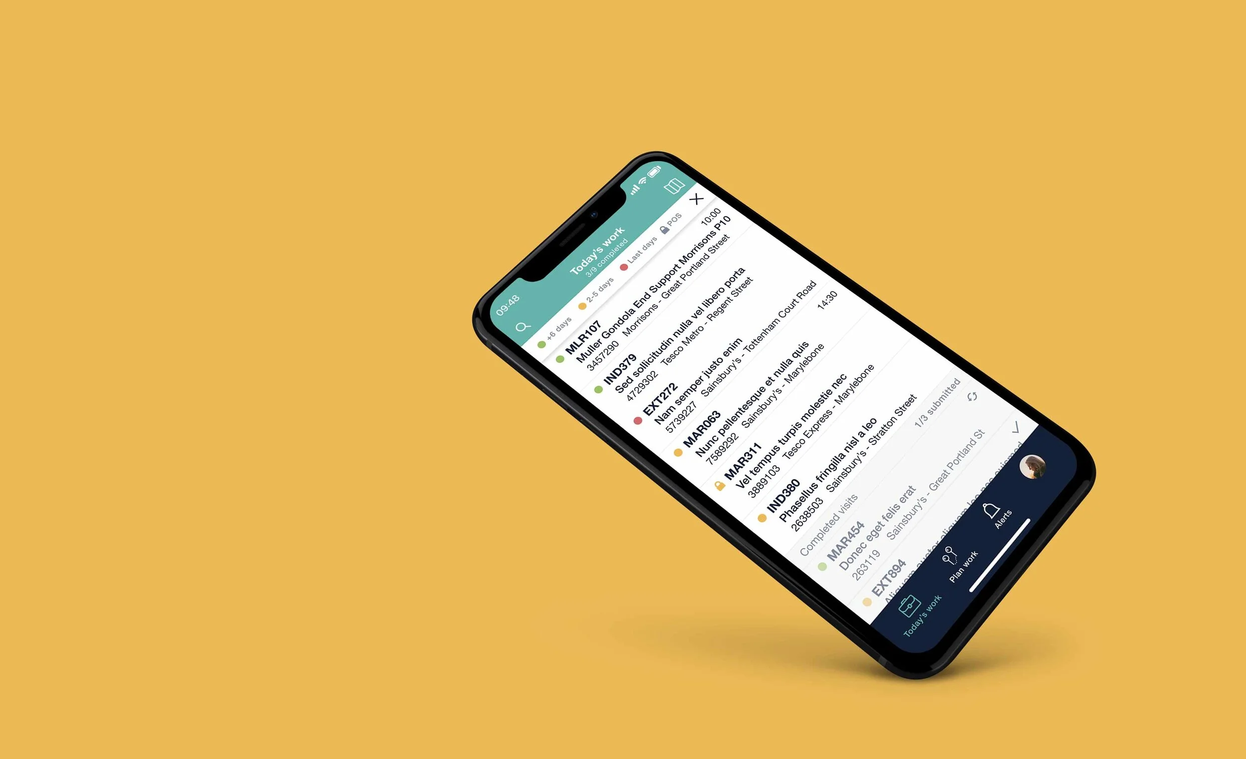
The Field Marketing team uses LISA to plan their daily retailer visits and to carry them out.
Their main mission is to ensure that their customer products are available on the shelves, displaying the right prices and spot new business possibilities.
Analysis and planning
The app is divided into two main sections:
Out of visit
Users can check their scheduled visits for the day, plan future visits, view visit info before starting, access the app settings, etc.
During a visit
Once the user get to a store, they need to start the visit they had scheduled and carry out necessary actions such as, auditing and marketing product, meeting with the store management, activating promotions, etc.
Navigation was the first issue that needed attention.
Before

The app navigation was very restrictive and limited the access to the rest of functionality
The visit overview screen was not very efficient. The user needed to open different screens by tapping on the buttons in order to view the visit information.
The landing screen when starting a visit, offered the same information than the visit overview and it was not very clear the actions the user needed to carry out.
After

I have added a tab bar as main navigation:
Giving visibility and straight access to the rest of functionalities
Improving the flow
I have incorporated swipe gesture for quick access to visit secondary actions: reschedule and unassigned.
The visit overview now displays all the useful information users need before starting their visits, in a single screen.
‘Start visit’ button has been prioritised and has more visibility.
I have turned the landing page into a menu that give users access to all the actions they need to carry out during the visit.
This menu also acts as summary of the actions they have completed (green) and the remaining ones (red=mandatory).
The visit info remains accessible from a tab at the top, but in a secondary position .
The challenge
The old app only allowed scheduling visits on the fly. The biggest challenge was to integrate the different visit plan statuses and improve planning efficiency.
These are the different planning statuses that users need to be able to work with.
Today’s visits: visits that the user has scheduled to complete today
Scheduled visits: visits that the users has scheduled for coming days or weeks
Assigned to me: visits that back office has assigned to the user, but the user hasn’t scheduled a completion date
Available visits: visits that need to be completed and are not assigned to anyone. Users can add them to their workload scheduling in advance or picking it up on the fly.
I simplified the previous visit planning statuses in the following way
Today’s work: Visits scheduled to complete today
Scheduled: any visits assigned to the user that have a completion date in the coming days or weeks
Non scheduled: visits assigned to the user without completion date and available visits that the user could auto-assign and schedule.

After studying different flows I concluded that the best option was to give users visibility of what has been scheduled in first place. That way they will know what days need planning and what days are already fully booked.
Tapping on a visit displays a calendar giving users the option to reschedule or un-assign the visit.
Tapping on the ‘Schedule more visits’ button will display any visits that need to be scheduled, whether they have been assigned by back office or they are just available to pick up.
'The suggested visits will be prioritised based on urgency (visits are now colour coded based on last completion day) and distance from current scheduled visits.
Final designs


Other projects

Heartbeat music player

Smart document library

Contract builder